Finance hub and reports
The /financials hub — six-cell KPI strip, finance overview panels (top 5 overdue, upcoming due in 7 days, recent payments), quick-action tiles, and the embedded analytics dashboard with revenue chart, GST quarterly view, and AI insights. The /reports surface with four report subpages — customer intelligence, supplier performance, expense report, stock movement — each architecturally distinct rather than a single configurable report builder.
Quick reference
- Finance hub lives at /financials — KPI strip, overview panels, quick actions, embedded analytics. Reports hub lives at /reports — top-level stat cards, revenue chart, top customers, low stock, recent sales, plus four links into the individual report subpages.
- Entitlement gate: full analytics requires Studio or Atelier plans. Lower-plan tenants land on a clean “upgrade to unlock” surface with a single CTA to /billing. Per-page permission gate:
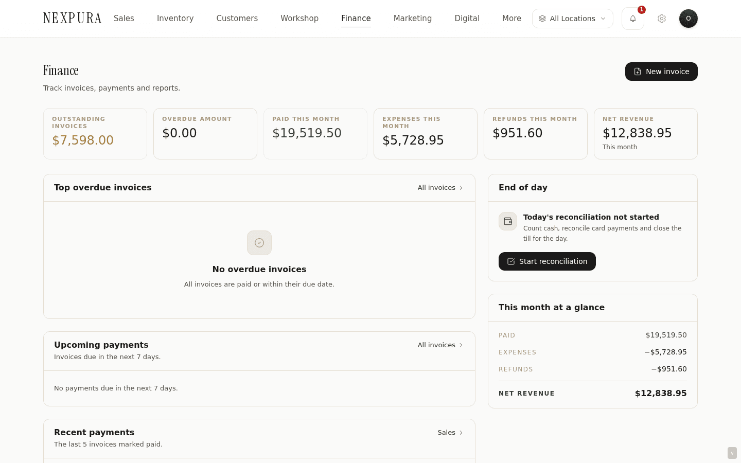
access_reportson the per-page server actions. - Finance hub KPI strip (six cells): Outstanding, Overdue, Paid This Month, Expenses, Refunds, Net Revenue. Outstanding and Overdue use the same predicates as the invoice list's KPI strip; Paid This Month is POS sales + standalone (non-POS) paid invoices — sale-linked invoices are deduplicated to avoid double counting POS revenue.
- Finance overview panels: top 5 overdue invoices sorted oldest-due-first, upcoming payments (next 7 days), recent payments (last 5 paid), and an EOD reconciliation status indicator that surfaces whether today's EOD has been started or closed.
- Four report subpages under /reports — each architecturally distinct, not a single configurable builder: /reports/customers (customer intelligence — spend, AOV, frequency), /reports/suppliers (supplier performance — order count, spend, delivery times, returns), /reports/expenses (filter and export expenses by category and date), /reports/stock (stock movement — stock-in, stock-out, adjustments from the activity_log).
- The /financials/reconciliation subpage (owner + manager only, gated on the a1_money_correctness feature flag) is a higher-privilege reconciliation tool that surfaces deltas across the sale / invoice / payment / refund / GL surfaces. Tenants without the flag see a staged-rollout notice; the canonical EOD reconciliation is on /eod.
- Currency: every figure on /financials and /reports renders in the tenant's configured currency from business profile. See the “Changing currency after you've traded” question below for the operational quirk that affects historical reports.
Walkthrough
1. Open the Finance hub as a morning check
Go to /financials at the start of the day. The KPI strip across the top gives the six-figure read of where the books stand right now — Outstanding, Overdue, Paid This Month, Expenses, Refunds, Net Revenue.
2. Use the overview panels to triage
The top-5 overdue panel surfaces the invoices oldest-due-first — clicking through opens the invoice detail page where you can record a payment, re-send a reminder, or void. The upcoming-payments panel (next 7 days) is the heads-up for which invoices are about to slip into overdue if not collected — the right place to start a proactive follow-up call.
The recent-payments panel is the “what just landed” ledger — useful when a customer calls saying they paid and you want to confirm the deposit reached the right invoice.
The EOD reconciliation tile indicates whether today's drawer count has been started or submitted. A red “not started” mid-day on a busy retail tenant is a signal that the afternoon closer is busy with customers and hasn't yet got to the count.
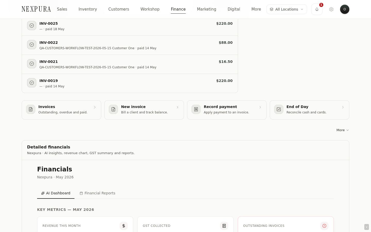
3. Use the quick-action tiles to jump
Three quick-action tile groups: Invoices and payments (into /invoices, /invoices/new, /invoices?status=overdue), Expenses and refunds (into /expenses, /expenses/new, /refunds), and Operations (into /eod, /reports, the dashboard). The tiles are not new functionality — they're organised jumping-off points for the surfaces the operator visits most.
4. Scroll into the embedded analytics dashboard
Below the overview panels and quick actions, the embedded analytics dashboard renders the same surface that was the historic /financials view before the hub redesign. Revenue chart (last 30 days, daily revenue and refund bars), AI insights panel (Atelier plan), GST quarterly breakdown (revenue, GST collected, last four quarters), payment-method breakdown (where the month's revenue came from by tender), average-sale-value tile.
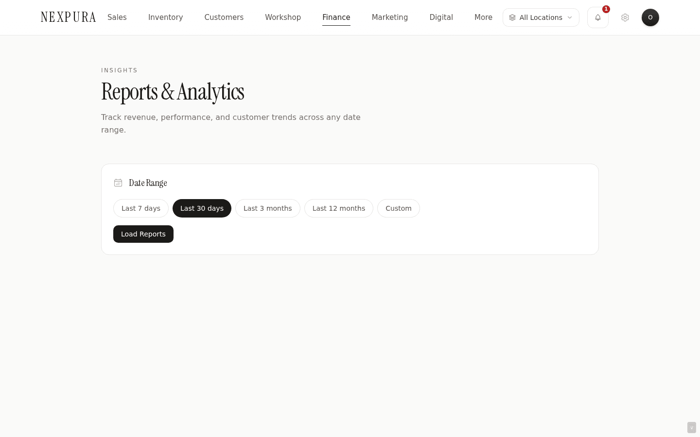
5. Open the Reports hub at /reports
The Reports hub is the wider operational dashboard — eight stat cards covering revenue this month, outstanding invoices, inventory value, sales count, active repairs, active bespoke jobs, new customers, low stock items. Below the cards is a six-month revenue chart (one bar per month), a month-over-month comparison, a top-8 customers list by revenue, a low-stock list, and a recent-sales list.
6. Drill into Customer Intelligence
/reports/customers is the customer-revenue analytics surface. Per-customer rows with full name, email, total spend, sale count, AOV (computed: total spend / sale count), store credit balance, VIP flag. Only revenue-bearing sales (status = paid or completed) feed totalSpend — refunded / voided / cancelled sales are excluded so a $5,000 sale that got refunded doesn't inflate the customer's spend figure.
CSV export from this surface is the canonical way to hand a customer list to your marketing or BDM team for an outbound segment — the same data the Segments page at /docs/marketing-and-automations/segments uses for rule-based audience building.
7. Drill into Supplier Performance
/reports/suppliers rolls up the supplier ledger across purchase orders and supplier-side invoices. Per-supplier rows with name, contact, payment terms, order count, total spend, average delivery days (purchase order received_at minus created_at), last-order date, return rate, outstanding amount owed.
8. Drill into the Expense Report
/reports/expenses is the expense filtering and export surface — date range picker, category multi-select (stock, rent, utilities, marketing, staffing, equipment, repairs, other), search, sortable columns. Hand-off to the bookkeeper at month-end is via CSV export from this page.
9. Drill into Stock Movement
/reports/stock is the inventory-side audit log — every stock-in, stock-out, and adjustment event from the activity_log table, plus purchase-order receipts as stock-in events. Date range filter, event-type filter (stock_in, stock_out, stock_adjust). Used for investigating “where did this item come from” and “why is the on-hand count different from last week” questions.
Common questions
Why are reports separate pages rather than one configurable report builder?
Two non-obvious goals served at once. First, each report's data shape is fundamentally different. Customer intelligence reads from customers + sales with revenue-status filtering and computes spend / AOV / frequency aggregates. Supplier performance reads from suppliers + purchase_orders with timing math (delivery days, return rates) — entirely different tables and entirely different aggregations. Expense report reads from expenses with category and date filters. Stock movement reads from activity_log + purchase order receipts. A single configurable builder would have to handle all four schemas plus the join logic, plus a UI that exposes every field in every report — which becomes a query-builder UX, not a report. The cost of one builder is a worse experience for the four specific reports operators actually run.
Second, each report has different access controls and refresh expectations. Customer intelligence carries customer PII and feeds the marketing segment surface — restrict-by-role matters more here than in stock movement. Supplier performance carries cost data that some tenants restrict from salesperson roles while showing to managers. Expense report and stock movement have different refresh cadences (expenses are entered ad-hoc, stock movements fire on every inventory write). Separating into four pages lets each evolve its access gate and its caching independently. A one-size-fits-all builder would either over- restrict or under-restrict to maintain a single gate.
Why do Paid This Month figures on /financials and /reports sometimes disagree?
They're computing slightly different things. /financials Paid This Month is POS sales (paid or completed status in the current calendar month) plus standalone non-POS paid invoices (sale_id IS NULL, status = paid, created_at this month) — the two are summed without double counting because every POS sale produces a linked invoice with sale_id set and that linked invoice is excluded. /reports Revenue This Month historically counted paid invoices only, including the sale-linked ones — which double-counted POS revenue for tenants that ran heavy POS volume. The fix is in flight; for now, /financials is the authoritative figure and the /reports stat card is the legacy view.
When the two are reconciled, /reports Revenue This Month will match /financials Paid This Month exactly. The KPI in the meantime is accurate for tenants that run mostly invoiced (B2B-style) revenue and over-states for POS- heavy tenants. Use /financials as the source of truth for the headline number.
I changed my tenant currency on the business profile after I'd already traded. What happens to historical reports?
The currency display switches immediately across every figure on /financials and /reports — the new currency code is rendered for both new and historical figures. The underlying stored amounts don't change (they're NUMERIC(14,2) values, currency- code-agnostic), so the math reconciles, but the historical figures are now labeled in the new currency without having been converted. A tenant that traded $50,000 in AUD and switches to USD will see $50,000 USD in the historical reports — same number, different label, materially different amount.
The operational guidance is to set currency once during onboarding and treat it as effectively immutable for that tenant. If a currency change is unavoidable (a business moving primary markets), the right shape is to run an export of historical data first, do the currency switch, and treat the prior period as a different reporting baseline. We don't ship a currency-conversion-and- reprice utility because the FX-rate decisions involved (which day's rate? Cost basis or revenue basis?) need a real accounting conversation, not a default. See business profile for the currency configuration details.
The GST quarterly view shows my GST collected, but how do I file it?
The GST quarterly view is a read-only summary for visibility — it shows revenue and GST collected per quarter so you can confirm the numbers before quarter-end. Filing is via your accounting tool (Xero, MYOB, QuickBooks) or directly with the ATO. The Xero integration syncs invoices and payments into Xero where the BAS preparation lives; tenants without Xero hand the figures from /financials to their bookkeeper. The export from /reports/expenses feeds the expense side of the BAS the same way.
Net Revenue doesn't match Paid This Month minus Expenses This Month
Net Revenue on the Finance hub is Paid This Month minus Refunds This Month minus Expenses This Month. The third term is what the simpler mental subtraction sometimes misses — refunds are deducted alongside expenses, not lumped into one. This makes the figure a closer read of “net cash in from operations” than “revenue minus costs” — a refund returns money to a customer, which is a negative on the revenue side, separate from expenses (which are money out to suppliers, landlords, staff).
The decomposition surfaces in the KPI strip itself — Paid This Month, Refunds, Expenses, Net Revenue are four cells, not one. The numbers reconcile if you walk through all three terms; the “why is Net Revenue lower than I expected” question usually answers itself once Refunds is accounted for.
Troubleshooting
“Advanced Financials” upgrade screen instead of the hub
Symptom: /financials renders an upgrade prompt rather than the KPI strip and overview panels. Cause: the tenant is on a lower-tier plan (Foundation, Essentials) that doesn't include the analytics entitlement. Fix: upgrade to Studio or Atelier via /billing. The dashboard at /dashboard continues to surface the basic operational KPIs (revenue this month, outstanding, active repairs) without the full analytics view.
“Access Denied” on a /reports subpage
Symptom: a staff member can't open a /reports subpage; the page renders an access-denied placeholder. Cause: the access_reports permission isn't enabled for that user's role. Salesperson, workshop, and accountant roles all have it off by default — only owner and manager land on the report subpages automatically. Fix: an owner or manager toggles access_reports on for the relevant role at /settings/team if the staff member needs the access. See team and roles for the permission matrix.
/financials/reconciliation says “in staged rollout”
Symptom: the reconciliation subpage shows an amber staged-rollout notice instead of the reconciliation table. Cause: the a1_money_correctness feature flag is off for this tenant. The reconciliation surface requires the A1 transactional flow (refund + GL ledger entries) to be in place — opt-in is per-tenant during the staged rollout. Fix: contact support to opt in to the A1 rollout. The canonical end-of-day reconciliation at /eod covers daily-close needs without the flag.
Top customer's totalSpend doesn't match their customer-detail page
Symptom: the totalSpend figure on /reports/customers doesn't match the customer's spend on the customer detail page. Cause: the report filters to revenue-bearing statuses (paid, completed) while the customer detail page may render an older sum that included refunded sales. Fix: the report's filtered figure is the correct one for spend analytics. The customer detail page's sum is the legacy view and is being aligned to the same revenue-status filter.
Revenue chart on /reports shows empty bars for recent months
Symptom: the six-month revenue chart on /reports has missing or zero bars for months you know had sales. Cause: the chart sources from paid invoices only — the legacy shape mentioned in the Paid This Month FAQ above. Tenants that run POS-only (most sales completed at the register without an invoice being marked paid) see empty bars even though the dashboard at /dashboard shows the revenue. Fix: use the /financials hub's revenue chart for the authoritative read — it sources from both sales and invoices and is being made the canonical surface as the legacy /reports chart is retired. The dashboard at /dashboard also pulls from the same complete shape.
Related
- Invoices — Outstanding, Overdue, and Paid This Month KPIs on the Finance hub all source from the same invoices and payments tables documented in detail on the invoices page
- Expenses — the Expenses KPI on the Finance hub and the /reports/expenses subpage both source from the expenses table
- End-of-day reconciliation — the EOD-submitted status surfaces on the Finance hub as the “Reconciliation Started” tile and feeds the daily cash close
- Customers and clienteling — Customer Intelligence on /reports/customers is the analytics view of the same customer records documented on the customers section
- Business profile — tenant currency, timezone, and tax configuration all drive the figures rendered on /financials and /reports
- Billing and subscription — the analytics entitlement is plan-gated; Studio and Atelier unlock the full hub and the reports subpages